Edvisor.io
Business Reporting
B2B Product Design, Data Visualization, UX, UI | Spring 2017
Edvisor is a web-based CRM and marketplace for the international education industry, connecting education agents with schools worldwide. Education agents can manage their student pipelines, browse and quote courses, and submit registrations.
The reporting feature was tailored towards users on the agent side of the platform. These education agents are global professionals who help international students shop for courses abroad — most often, English language courses. They are both men and women, in their 30s to 60s. They live worldwide, with Edvisor’s largest user base in Latin America. English is likely their second language; their first is likely Spanish or Portuguese.
The size and structure of every agency is unique. Some are single-person operations, others have hundreds of employees. Very few industry standards exist, and most work is done on paper, in Excel, and via long email chains. Agents work on desktop computers and very rarely engage on mobile. At times, their technical savvy could be improved.
I took the lead on all stages of the reporting project, including customer interviews, surveys, wireframes, prototypes, and user testing. I consulted with my design lead, and members of the Sales, Customer, and Engineering teams.
The Problem
We don’t have any reporting or data analysis features. Agent users are actively using the platform and would like to harness this rich info to inform their growth strategies.
Project Goal
Create a reporting feature that provides users with insightful business metrics
Research
Interviews
I composed my research group from a list of users who had submitted feedback requesting a reporting feature. I set up video interviews with each user, asking questions including:
What do you currently use for business reporting?
What do you hope to learn from these reports?
What information would be helpful in these reports?
How do you hope to harness these reports?
Surveys
Surveys were also sent, asking for users’ priorities on which metrics were most important to them and how they wanted to sort and refine information.
Conclusion
What users wanted varied greatly, and generally was based on the size of their agency.
Small agencies cared about financials; they wanted stats on commissions and which schools gave them the most business
Large agencies cared about employee performance; they wanted to monitor individual agents’ and offices’ sales and commissions
Information considered key to one user might be irrelevant to another user. With such a large span of preferences, the solution needed to be both customizable and robust.
Report Contents
Before a reporting feature could be designed, I had to establish what information the reports would display.
Engineering provided me with all of the available user data sets we could pull from. From that data, I brainstormed possible questions that could be asked about each data set. Those questions were referenced against customer feedback and used to create five report groups that met the needs of all types of users.
How much in tuition has my agency sold?
How much commission has my agency made?
Which student demographics, schools, and destination countries make my agency the most money?
How much money am I owed by my clients?
When can I expect this money to come in?
How many quotes does my agency send?
Which student demographics, schools, and destinations do I quote the most?
How successful are my quotes?
How many student leads am I registering to schools?
How long am I registering them for?
How many students make it all the way through my sales pipeline?
Where in my sales pipeline do leads drop off?
Flow & Architecture
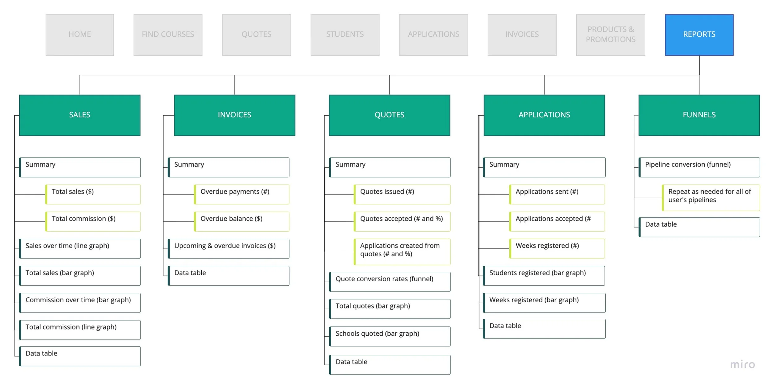
A Reports feature was put into Edvisor’s existing sidebar navigation, with five sub-links: one for each of the five report categories. Each category has its own report page, consisting of report parameter definitions, high-level numbers, refinable data visualizations, and the original data table.
Site map showing Reports incorporated into the app’s existing navigation + the new feature’s information architecture
Page Design
Five report pages were built, each following the same structure.
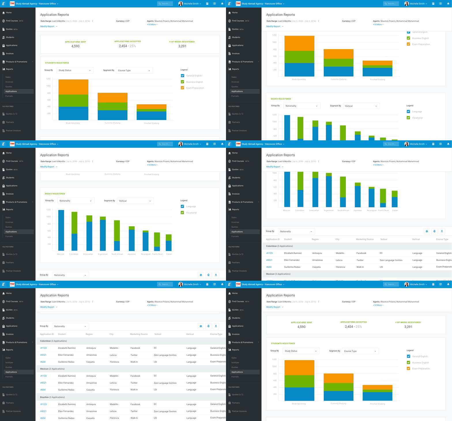
Beneath each report title are three fields: date range, display currency, and the names of either selected agents or offices. Users can expand this section by clicking Modify Report to refine each parameter.
An at-a-glance display of important totals is prominently displayed next.
Users can modify their report’s date range and display currency. They can choose to view data on either an office location or personnel level.
With a user base unfamiliar with Tableau and other complex data visualizations, the best solution was a simple one: clean charts that can be easily refined.
Charts are presented on the page, displaying the answers to the questions brainstormed previously. One of three types of chart will be used, depending on the data displayed: a line graph, a bar graph, or a funnel. The checkboxes in the legend to the right of each chart can toggle groups of data on and off.
The line graph is used for reports that show something over time, using an X-axis of date. If desired, users can choose to group their data by a selected parameter using the Group By dropdown.
The bar graph is used for reports that display figures or dollar amounts in the Y-axis and do not contain a date field. Users can choose their X-axis in the Group By dropdown, which auto-selects the first option. If desired, users can choose to further segment their bar graphs using a selected parameter in the Segment By dropdown.
A line graph displaying sales over time, grouped by sales vertical
A bar graph, depicting sales in each vertical grouped by student nationality
The funnel graph is used exclusively on the Funnels report, to display conversion rates between the sales pipeline stages on the X-axis. If desired, users can further segment the bars using a selected parameter in the Segment By dropdown.
The page ends with a table displaying the report’s data in a table, which can also be grouped by an optional parameter. The fields on the table can be refined and reordered, and raw XLS data can be downloaded and printed.
A table display, grouped by student nationality
A pipeline graph showing an agency’s conversion from lead to student graduation


